It takes time to build a landing page that converts. You agonize over all the details like finding the right theme, choosing a good cheap web host, writing copy and even carefully designing the size and placement of CTAs. But how much thought have you given to color?
by Jodie Manners
If you’re like most app developers, you use color to portray your brand. But what if I told you you could increase conversions on your landing page by throwing out that rule book and, instead, optimizing your page based on color psychology?
Ok, maybe not the whole book… just a few pages. By making a few small changes to the colors you use at key points on your landing page, you can inspire more viewers to download.
Here’s how…
What is color psychology?
Color psychology is the scientific study of the way hues affect human emotion and behavior. That might sound a little ‘fluffy’ but color psychology is based on sound research into the cultural, biological and evolutionary contexts of color.
The way we understand and interpret color varies across cultures and between people with different experiences. But there are some universals. For example, color psychology is the reason why:
- You don’t want to eat blue foods
- You feel calm in woodland and other green spaces
- You find it hard to ignore signs in orange and red
Whether we’re aware of it or not, we feel the effects of color psychology every day. But don’t take my word for it…
Why should you use colour psychology on your mobile app landing page?
According to science, color is the most recognizable feature of a brand. In fact, studies show that between 62-90% of our initial judgement of a product is based on color alone.
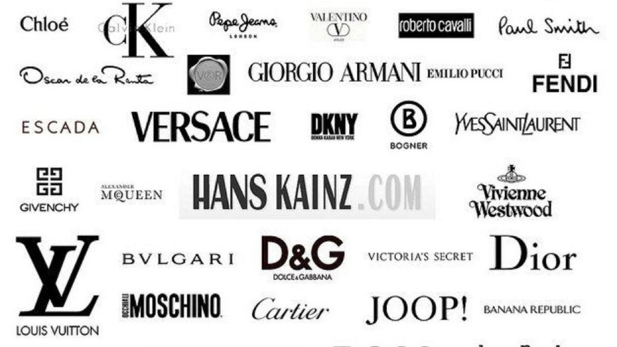
Brands have always used color to appeal to certain audiences or portray certain messages about their products. For example, black signifies luxury, so it’s used by high-end brands with expensive products like Prada and Louis Vuitton.

Credit: Business Upturn
On the other end of the scale, fast food outlets like Burger King and McDonalds use reds, oranges and yellows because these colors signify value or affordability. And, interestingly, seeing red quickens our heart-rate and makes us faster, which is probably why some cultures associate red with love and passion.
So how can you take advantage of the science?
How to use color to boost conversions on your mobile app landing page?
The answer is a lot simpler than you think. You don’t have to change all your CTAs to red and you don’t have to mess up your branding to increase conversions on your mobile app landing page.
All you have to do is use the right colors for your audience and product and increase color contrasts on your page.
Using the right colors for your audience and product
We’re not saying you should take leaf out of Bic’s book and go full-pink if your audience is primarily female. That’s not color psychology, that’s just bad marketing.

Credit: The Daily Mail UK
But you should tailor your color pallet to your brand message. For example, many sustainable brands use earthy tones on their product landing pages because those colors connect best with their audience.
Similarly, if your app is all about meditation, it doesn’t make sense to use colors that are known to excite the central nervous system, like red. Not even for your CTAs.
This is important if your app is a subsection of a larger business. For example, if you’ve created a cycle route app for a car manufacturer to encourage employees to cycle to work. Rather than just use the car manufacturer’s standard brand colors, you should choose colors that signify nature and motivation like greens, oranges and yellows.
But it’s not all about which colors you use…
Using high-contrast colors
According to leading conversion optimization institute CXL, no single color is consistently better than another at increasing web conversions. But, using high contrasting colors to accentuate key information and draw attention to actions does work.
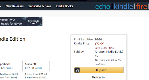
This is why successful eCommerce platforms, e.g. Amazon, use high-contrast color palettes like white, black and yellow…

Against a white background, yellow pops. It draws the eye to the action on the page, which is exactly what you want to do on your landing page.
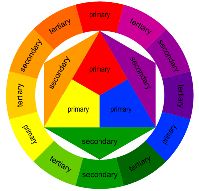
The best way to do this is to take your main brand color and find it’s opposite using a color wheel. Then alter the hue to one that works with your branding.

Credit: UXPlanet
So, say your primary brand colors are earthy green and grey-black. The highest contrast color would be red but you wouldn’t want a hue that’s too sharp because it won’t match your brand. So find an earthy hue. This will work with your branding and draw your viewer’s eye to your CTAs.
That’s a wrap
Color psychology is a powerful but often overlooked way to increase conversions online. By making a few small tweaks like fitting your color palette to your audience and using high contrast colors to highlight key information, you can convince more visitors to click that download button.
Author bio: “Jodie is a Conversion Copywriter and Content Strategist working with bold B2B SaaS and tech brands. Before founding This Copy Sticks, she spent a decade selling the toughest value proposition around and raised £2 million for charities before her 25th birthday. After 10 years in fundraising, Jodie now helps tech-mad trailblazers grow their businesses”
Share this article on