Understanding Adaptive Design in Mobile App Development

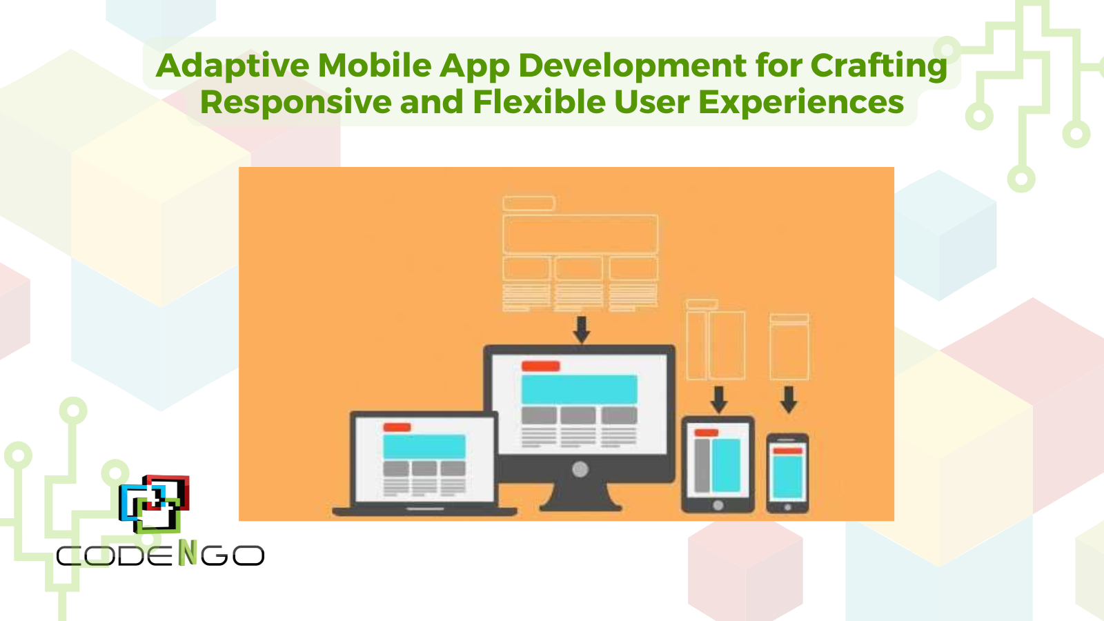
Adaptive design is an approach that customizes the user experience for different screen sizes and device capabilities, enabling apps to work and look great on various platforms. Unlike responsive design, which often relies on flexible grids and percentages to adjust layout, adaptive design is typically built around specific breakpoints or screen sizes. This approach tailors the app’s interface and functionality to fit each device’s specifications, creating a more customized and user-friendly experience.
For mobile app developers, adaptive design offers a powerful method for ensuring usability across devices, especially as the variety of mobile screen sizes grows. It’s essential for keeping users engaged and satisfied with the app, regardless of how they access it.
Core Principles of Adaptive Mobile Design
-
Define Breakpoints for Key Devices: Breakpoints are screen width values at which the app layout should change to maintain usability. Unlike responsive design, which can scale for any screen size, adaptive design typically sets specific layouts for selected screen widths (e.g., 320px, 480px, 720px, and 1024px). These layouts allow developers to design experiences suited to specific devices without compromising user experience.
-
Prioritize User-Centered Design: Adaptive design revolves around providing a seamless experience for each user. User-centered design focuses on the habits, needs, and expectations of the target audience. For example, a tablet user might expect a more spacious layout with larger interactive elements, while a smartphone user might prefer more compact, thumb-friendly controls.
-
Optimized Content Delivery: Optimizing images, videos, and interactive elements for different devices can greatly enhance app performance. Smaller devices might display lower-resolution assets to save bandwidth and processing power, while larger screens can leverage higher-resolution visuals. This ensures the app performs efficiently on any device, without compromising visual quality.
-
Efficient Use of Native Device Capabilities: Adaptive design takes advantage of unique device features, such as GPS, camera, and touch-based gestures, to provide a native feel for each platform. For example, while an app may use a swipe gesture on a smartphone, it might adapt to a two-finger gesture on larger tablets to accommodate different usage patterns.
-
Flexible UI Elements: Adaptive apps use flexible UI components that adjust based on the screen dimensions and device orientation. Elements like buttons, icons, and menus are designed to be easily scalable and adaptable. This not only improves usability but also ensures that visual consistency is maintained across screens.
Key Benefits of Adaptive Mobile App Development
-
Enhanced User Experience: Adaptive design offers a tailored experience for each device, making the app feel intuitive and easy to navigate, which can reduce user frustration and enhance satisfaction.
-
Improved Performance: With adaptive design, only the required resources and features load for each device, leading to faster load times and optimized performance.
-
Higher User Retention Rates: Apps that work seamlessly across devices tend to retain users longer. With an adaptive approach, users are less likely to abandon the app due to poor experience on their specific device.
-
Increased Reach Across Devices: Adaptive apps can cater to users on a range of devices, expanding the app’s potential user base and improving accessibility.
Implementing Adaptive Design: Best Practices
-
Use Frameworks and Libraries: Many frameworks, such as Flutter and React Native, support adaptive design through customizable components and layouts. These frameworks simplify the process of building and maintaining adaptive interfaces across different devices.
-
Leverage Responsive Grids with Adaptation Options: While adaptive design differs from responsive design, responsive grid systems can be incorporated to create a flexible layout foundation, particularly useful for creating a fluid experience across devices. Tools like Flexbox in CSS and the Auto Layout feature in SwiftUI can aid in building responsive yet adaptable structures.
-
Conduct Usability Testing on Key Devices: Testing on a range of devices is crucial for adaptive design. Device emulators are valuable, but testing on physical devices provides a more accurate understanding of the app’s performance, layout, and usability. This helps identify potential issues before the app reaches users.
-
Optimize Images and Content for Each Screen: Different screen sizes require different image sizes and resolutions. Using vector images or scalable assets ensures that graphics remain sharp, while adaptive image loading optimizes speed and performance.
-
Implement Analytics for User Insights: Adaptive design should be informed by real-world data. Analyzing how users interact with the app across devices can highlight areas that need further adaptation and improvement, ensuring the app evolves alongside user needs.
Adaptive Design Challenges and How to Overcome Them
-
Increased Complexity and Development Time: Developing adaptive layouts for multiple devices can be complex and time-consuming. To streamline the process, prioritize the most commonly used devices in your target audience and create layouts for those first.
-
Consistency Across Devices: Maintaining a consistent user experience across devices is challenging, especially with adaptive design’s device-specific layouts. Creating a style guide with consistent typography, color schemes, and interaction patterns can help ensure uniformity.
-
Balancing Performance and Features: Adaptive design requires balancing device capabilities with app functionality. To avoid performance issues, prioritize essential features for smaller devices, and offer enhanced functionalities for larger screens only when necessary.
The Future of Adaptive Mobile Design
As new devices continue to emerge, from foldable smartphones to wearable technology, adaptive design will play an increasingly vital role in mobile app development. Future trends may involve adaptive layouts that respond dynamically to unusual form factors and even screen orientations that adjust based on user preferences and environmental factors.
Conclusion
Adaptive mobile app development is a valuable approach for delivering a high-quality, consistent experience across a wide range of devices. By focusing on breakpoints, optimized content, and flexible design elements, developers can create applications that feel natural and engaging, whether they’re used on a tablet, smartphone, or beyond. As mobile devices continue to evolve, investing in adaptive design practices ensures that your app is prepared to meet users’ expectations, today and in the future.
Share this article on